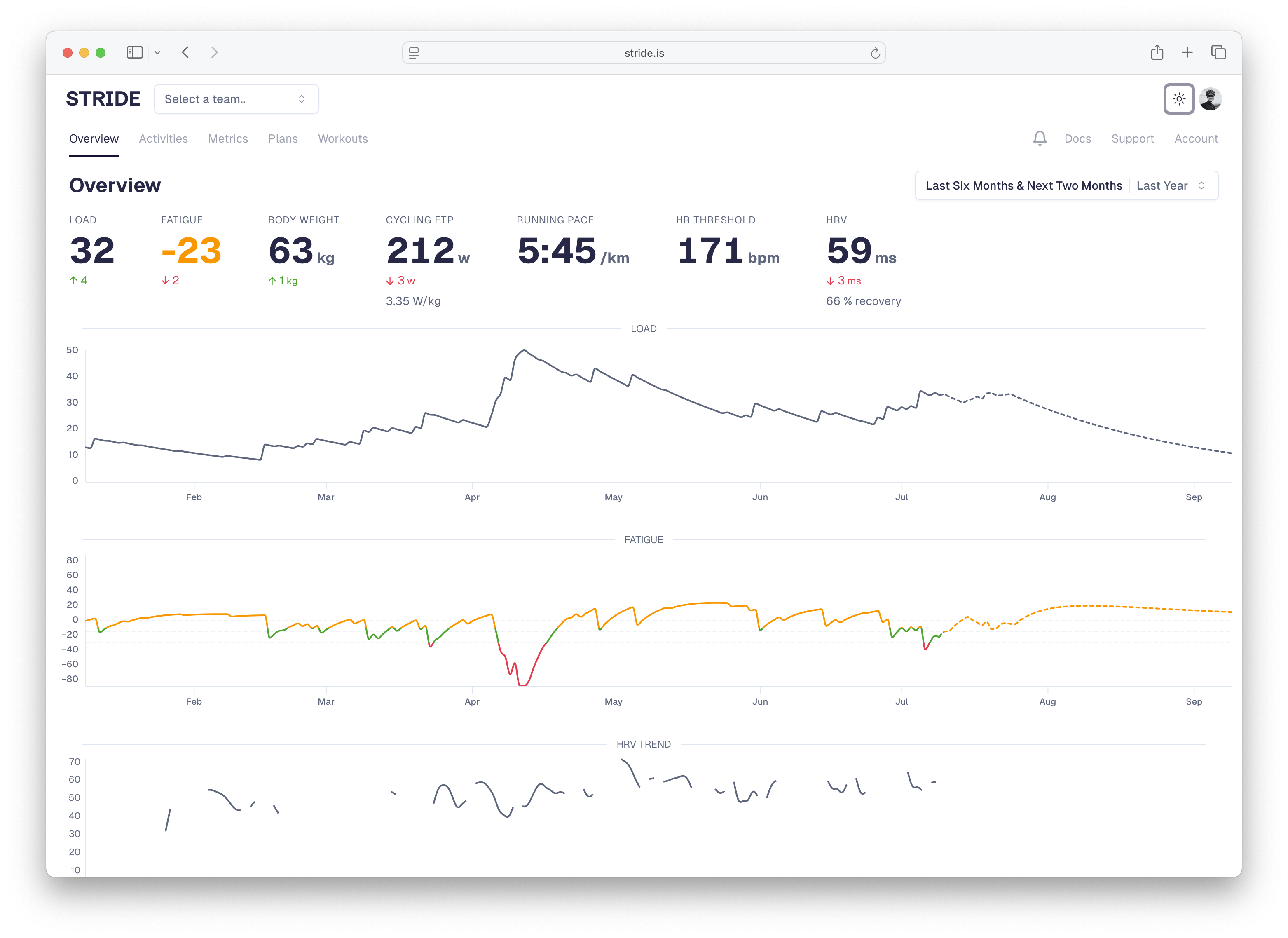
Dashboard Overview
Your Stride dashboard is the command center for your training. It provides at-a-glance insights into your fitness, recent activities, and upcoming workouts.Main Dashboard Sections
Current Status Panel
Located at the top, showing your key metrics:Load
Your long term stress level
Fatigue
Your readiness to perform
Understanding the Numbers
Color Coding:- 🟢 Green: Optimal range
- 🟡 Yellow: Caution/attention needed
- 🔴 Red: Warning/take action
- Fatigue < -20: You’re training hard, building fitness
- Fatigue -10 to +5: Balanced, ready for quality work
- Fatigue > +5: Very fresh, perhaps too rested
Performance Charts
Load & Fatigue Graph
The main chart shows your fitness journey: What to Look For:- Load trending up: Building resilience ✅
- Fatigue dips: Heavy training periods
- Fatigue peaks: Taper/rest periods
Power Curves
Your best efforts across all durations: Key Durations:- 5 seconds: Sprint power
- 1 minute: Anaerobic capacity
- 5 minutes: VO2 max power
- 20 minutes: Threshold indicator
- 60 minutes: True threshold
- Last 30 days
- Last 90 days
- Season best
- All-time best
Click any point on the curve to see which activity produced that power.